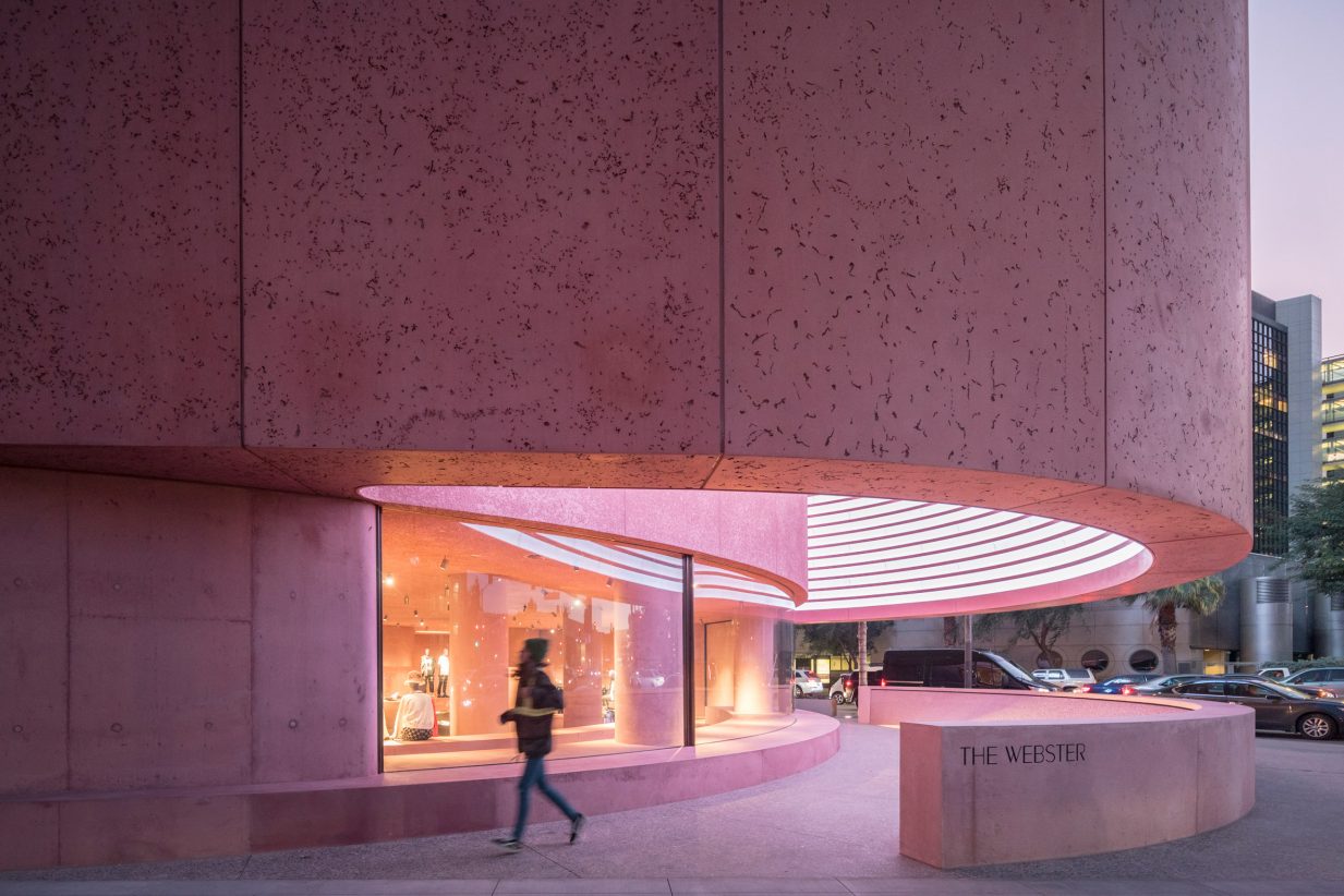
The Webster’s candy-coloured brutalist façade by Adjaye Associates is located next to the Beverly Center in L.A.
Image © Laurian Ghinitoiu
Five years ago, pink seemed like a welcome but passing fad. Now, rosy hues are everywhere, even on building exteriors. So how did such a peaceful shade gain so much power as an expression of the times?
Pinpointing what triggered the rise of pink isn’t easy, but the blush-to-ruby spectrum has become everyone’s favourite family of hues. Some point to Wes Anderson’s 2014 film Grand Budapest Hotel as the start of the rose-saturated movement; others credit millennials for releasing pink from its restricted role as the preferred colour of little girl’s bedrooms to a more universal – and nonbinary – fashion statement. Where ever it began, pink isn’t going anywhere yet. In 2014, Pantone declared Millennial Pink Color of the Year. In 2019, Living Coral was bestowed the honour, a shade only slightly more cadmium. According to Pantone, pale reds have remained popular for at least two reasons: They encourage lightheartedness, and they channel “our innate need for optimism and joyful pursuits.” Herein are five projects that have embraced pink, both inside and out.
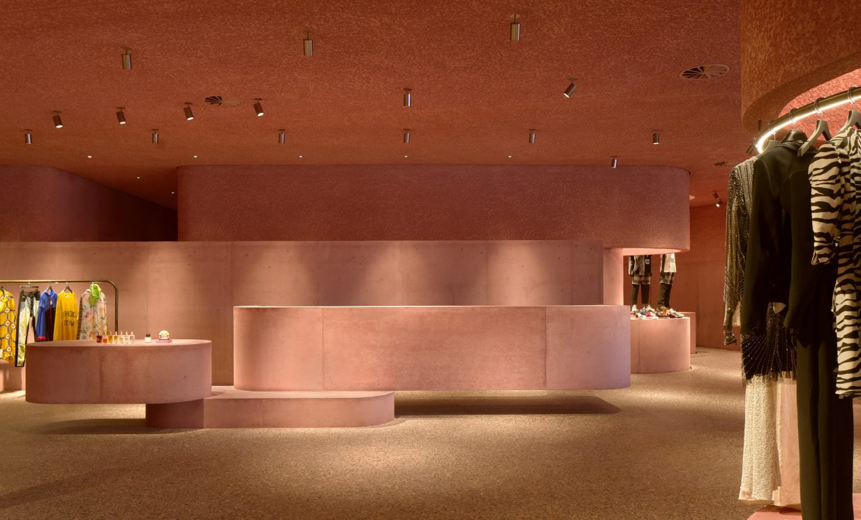
The pink-dyed concrete continues inside with matching cast-in-place plinths and columns.
Image © Dror Baldinger
The Webster (2020), Los Angeles, by Adjaye Associates
British-Ghanaian architect Sir David Adjaye began using red early in his career, most notably with the cardinal red exterior of the Aïshti Foundation galleria in Beirut, Lebanon. His most recent project is the flagship store for luxury clothing retailer The Webster. Located in Los Angeles, the building features a curved and cantilevered façade made of concrete that has been injected with pink dye. Its interior is equally rosy and akin to a sculptural field featuring cast-in-place concrete columns and teardrop-shaped plinths that serve as merchandise displays. All this sunset colouring is an ode to the luminosity of California, where the Pacific light naturally amplifies saturated hues.
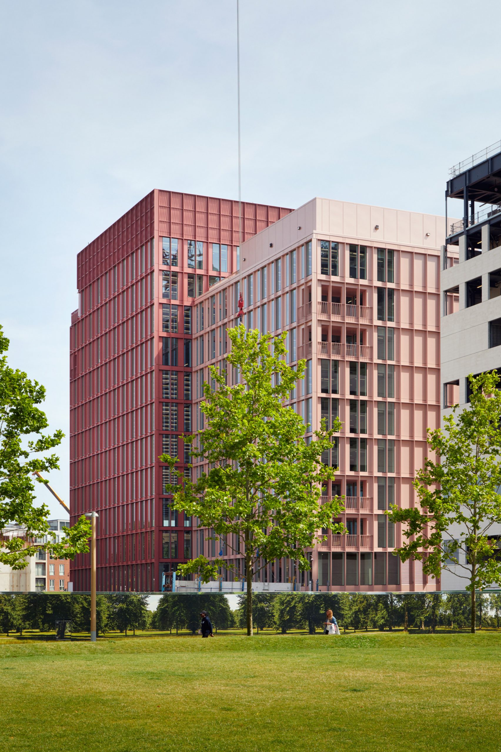
R7 mixes the modernist look of Mies van der Rohe’s aluminum fins with a coating of unabashedly pink tones.
Image © Duggan Morris
R7 office building (2017), London by Morris & Company
Located in the fast-developing area of King’s Cross in London, R7 is an office and mixed-used building that rises 11 storeys and is clad in two distinct tones: pink and salmon pink. Two sides of the aluminum and glass building rise to different heights, splitting the building into companion blocks. Pink carries through the entire project, from the suspended lights in the colonnade to metal railings and paved terraces. According to architect Joe Morris, the studio used the colour in early drawings simply to set the new buildings a part from the surrounding structures. Eventually, it became an integral feature. “Pink is a colour that we use a lot,” says Morris. “It’s quite a human colour, it’s a colour we intuitively reach out for. We wanted the building to have a more domestic rather than corporate appearance.”
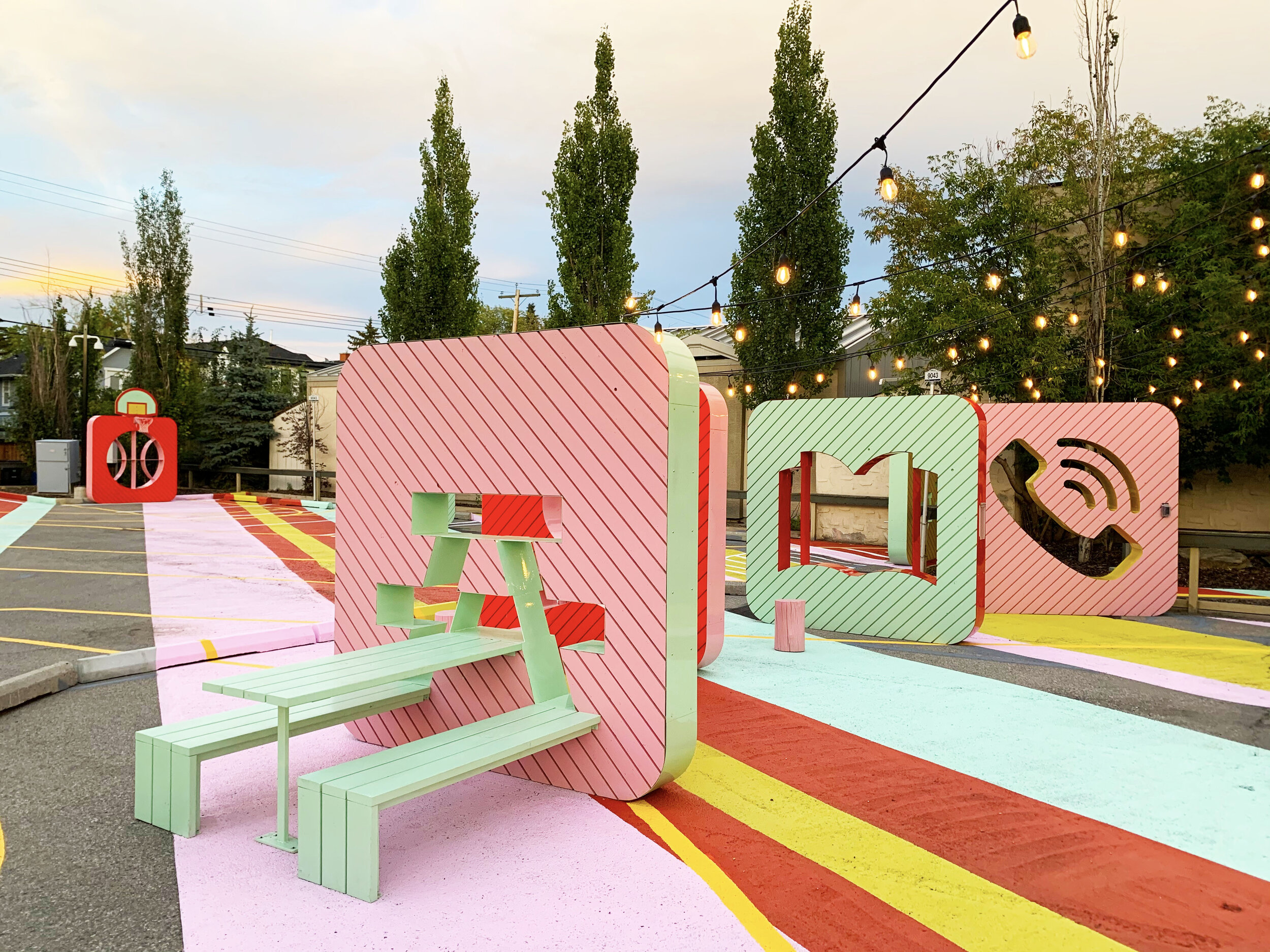
In Calgary, Public City Architects used vibrant colours to transform an underused parking lot into an urban park.
Image© Kokemor Studio
ParkPark (2020), Calgary, by Park City Architects
Cities are dominated by so much grey that pink can be a powerful antithesis to all that urban blandness. Calgary-based landscape firm Park City Architects recently used pastel shades for a public installation set up in an underused parking lot. The firm reimagined the 14,000-square-foot slab of pavement as a vibrant collision of colour and activities more often associated with parks rather than cars. Pink dominated a palette of other peppy hues, including yellow, green and blue, used to cover the asphalt and for a series of 3-D objects shaped like giant app squircles. Each object featured a symbolic icon of what parks usually contain, including trees, campfires and picnic benches. Called Park Park, the installation’s festive vibe and warm-colour embrace provided a welcoming space during the pandemic for people to explore and have a bit of fun.
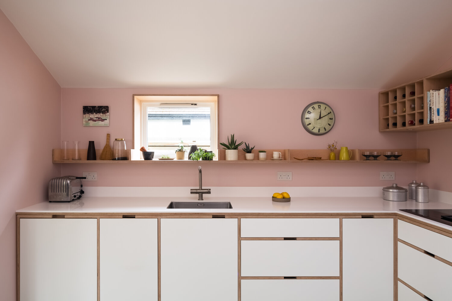
Uncommon Projects employed pink to give a small kitchen renovation more definition as a room onto its own.
Image © Jocelyn Low
Whitstable House, Kent, by Uncommon Projects
Creating a unique kitchen within an interwar bungalow was the aim of this renovation in the idyllic English coastal town of Whitstable, Kent. Designers Uncommon Projects crafted custom white cabinetry made from Fenix NTM and provided a gentle contrasting palette with blush walls and a duck-egg blue floor. The soothing palette helps to underline the kitchen’s identity within the home. “It is no longer a transitional zone,” say the architects, “but a visually engaging ‘destination’ space.”
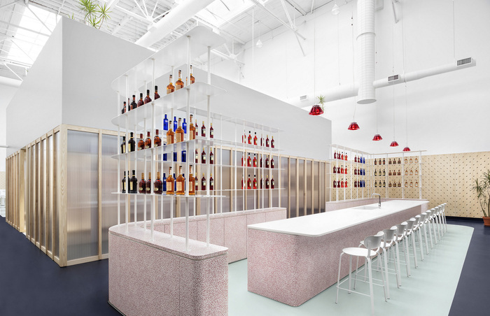
The tasting bar at Toronto’s Campari offices uses multiple pastel hues inspired by the 1980s Memphis Group.
Image © Lisa Petrole
Campari Group head office (2016), Toronto, by I-V Studio
When the Italian distillery Gruppo Campari set up an office in Toronto, it invited local design studio I-V to transform a former film studio into an open-concept office to house 22 employees and a tasting bar for showcasing its legendary spirits. The overall minimalist white interior is punctuated with delicate hues, including mint green and cobalt blue on the rubberized floor and white ash panels along the walls. Pink, though, is what gives the space balance and cohesion, with peachy hues chosen for modular sofas in breakout areas. The open bar’s countertop and cabinetry features a multi-pink-hued motif inspired by two references: Ettore Sottsass’s squiggly Bacterio pattern and cochineal, the insect traditionally used to give Campari its unusual ruby redness.
Originally written by Catherine Osborne